2. Introduction
pcassie is still under development, as is its documentation. However, baseline functionality is as follows.
There are a number of data you need to run pcassie. These are neatly organized in a series of keyword arguments:
>>> obs_args = {
   >>> 'wave': wave,
   >>> 'flux': flux,
   >>> 'mjd_obs': mjd_obs,
   >>> 'ra': ra,
   >>> 'dec': dec,
   >>> 'location': location
   >>> }
>>> planet_args = {
   >>> 'a': a,
   >>> 'P_orb': P_orb,
   >>> 'i': i,
   >>> 'ra': ra,
   >>> 'T_not': T_not,
   >>> 'v_sys': v_sys
   >>> }
>>> params = {
   >>> 'gap_size': gap_size,
   >>> 'P_orb': P_orb,
   >>> 'transit_start_end': (start, end),
   >>> 'remove_segments': [],
   >>> 'first_components': 5,
   >>> 'last_components': 0
   >>> }
Additionally, we will need to simulate a planetary spectrum to cross-correlate our data with. This can be done easily using MultiRex, based on TauRex.
>>> import multirex as mrex>>> star=mrex.Star(temperature=3317,radius=0.3243,mass=0.312) >>> planet=mrex.Planet(radius=1.289,mass=2.770) >>> atmosphere=mrex.Atmosphere( >>> temperature=696.3, # in K >>> base_pressure=1e5, # in Pa >>> top_pressure=1, # in Pa >>> fill_gas="He", # the gas that fills the atmosphere>>> composition=dict( >>> CO=-1, # This is the log10(mix-ratio) >>> H2O=-4, >>> )>>> ) >>> planet.set_atmosphere(atmosphere) >>> system=mrex.System(star=star,planet=planet,sma=0.01714)>>> system.make_tm()>>> # Give the simulated spectrum the same start and endpoints as the data wavelength grid. >>> wave_min = np.min(wave[0]) >>> wave_max = np.max(wave[0])>>> wns = mrex.Physics.wavenumber_grid(wl_min=wave_min*0.001,wl_max=wave_max*0.001,resolution=len(wave[0])) >>> wns, soim_flux = system.generate_spectrum(wns) >>> sim_wave = 1e4 * 1e3 / wns #conversion to angstroms
Where sim_wave and sim_flux are our simulated spectral grid.
Now, we can boot up pcassie and get started!
>>> import pcassie as pca
>>> results = pca.pipeline(sim_wave, sim_flux, **obs_args, **planet_args, **params)
pcassie.pipeline is the major implementation function, and the most useful function to look at in the documentation
as a first glace at what pcassie can do. The results = pca.pipeline call gives us a whole lot of data, which
we can reference in the pipeline documentation as well. For now, lets just mkae a few key plots.
>>> all_tdm, all_wave = results[0], results[2]
>>> first_detector_tdm, first_detector_wave = all_tdm[0], all_wave[0]
Ok! What we just did was select the time-domain PCA subtraction of our spectra, as well as the corresponding wavelength grids.
Check out Damiano et al. 2019 for an explanation of the difference between time-domain and wavelength-domain subtraction. For the
present use of pcassie, we will stic with only the time domain. That’s also what Damiano reccomends! However, you can still access
the wavelength-domain subtraction in results[1]. All three—time-domain, wavelength-domain, and the wavelength grids are returned as
lists, where each index is one detector. These aren’t necessarily 1-to-1 with every detector in the data, rather, is it the index of the
remaining detectors after we remove the detectors at indices in remove_segments. Above, we keep the first retained detector.
After grabbing the first remaining detector and it’s corresponding wavelength grid, we can now view the spectra as a color plot using
pca.plot_spectral_square, a useful general function that plots a 2d array against a 1d array into a colorplot.
>>> pca.plot_spectral_square(first_detector_tdm, first_detector_wave, title="First PCA-Subtracted Detector")
Cool! So thats what the post-PCA spectra looks like. Lets take a look at our cross-correlation function, which in general terms analyses how similar the post-PCA spectra are to our simulated exoplanet spectrum as one slides across the other.
>>> import numpy as np
>>> earth_frame_ccf = results[3]
>>> v_shift_range = np.linspace(-100_000, 100_000, 201)
>>> pca.plot_spectral_square(earth_frame_ccf, v_shift_range, title="Earth Frame CCF", x_label=r"Velocity $[kms^(-1)]$")
Neat! Here we see the cross-correlation values in the colorbar. The x-axis is the velocity shift range. In essence, we doppler-shift the simulated spectrum across a range of velocities and compute the CCF for every spectrum. We don’t see much of a signal, though….
We can also look at CCF in the rest frame of the planet, where the doppler shift is corrected. If there was a signal, we would see a vertical line of flux at v = 0 km/s.
>>> planet_frame_ccf, planet_frame_vgrid = results[4], results[5]
>>> pca.plot_spectral_square(planet_frame_ccf, planet_frame_vgrid, title="Planet Frame CCF", x_label=r"Velocity $[kms^(-1)]$")
The planet frame grid is cropped to avoid having to look at the blank edges that the wavelength grids have been shifted away from. We still don’t quite see a signal though!
We can examine the CCF a bit more clearly by only looking at the in-transit spectra of our CCF. Like this:
>>> in_transit = results[6]
>>> sum = pca.plot_intransit_ccfs(planet_frame_vgrid, in_transit)
Ah. We can see now that no where in the CCF signal is there a peak greater than the average noise. That doesn’t bode well.
We can try to optimize our signal by finding the best range of PCA components to remove. We can do this by:
>>> best_results, first_best_components, last_best_components, sn_max = pca.sample_full_pca_components(sim_wave,
 sim_flux, **obs_args, **planet_args, **params)
>>> print(f"Remove {first_best_components} from the front and {last_best_components} form the end to get a
 max S/N of {sn_max}.")
We can also check this against an injected signal, i.e., inserting what the exoplanet atmosphere would look like if it were there.
>>> injected = pca.inject_simulated_signal(sim_wave, sim_flux,
                     R_p, R_star, **obs_args, **planet_args)
>>> obs_args['flux'] = injected
>>> params['first_components'], params['last_components'] = first_best_components, last_best_components
>>> injected_results = pca.pipeline(sim_wave, sim_flux, **obs_args, **planet_args, **params)
Now, let’s see what our data shows and what our simulated injected signal shows.
>>> best_sum = pca.plot_intransit_ccfs(best_results[5], best_results[6])
>>> injected_sum = pca.plot_intransit_ccfs(injected_results[5], injected_results[6])
>>> import matplotlib.pyplot as plt
>>> plt.figure(figsize=(10, 6))
>>> plt.plot(best_results[5], best_sum, label="Data")
>>> plt.plot(best_results[5], injected_sum, label="1x Injection")
>>> plt.x_label(r"Velocity Range $[kms^(-1)]$")
>>> plt.y_label("CCF Co-added Value")
>>> plt.legend()
>>> plt.show()
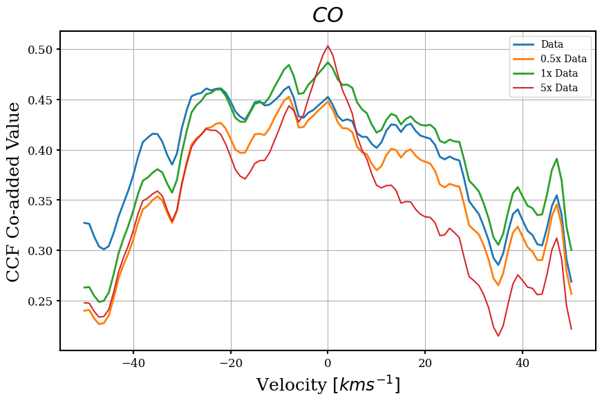
Hmm. So it looks like the injected peak is much stronger than any similar peak in the data. This likely means that there
is no atmosphere, at the very least, not anything like our simulated spectrum. Oh well! Not everywhere can be Kepler-22b.
I hope this brief tutorial gave you a broad sense of what pcassie can do, and more tutorials will populate this site
as I get the chance to work on them. If you have any questions or would like to report a bug, feel free to email me at
kenny.phan@yale.edu).